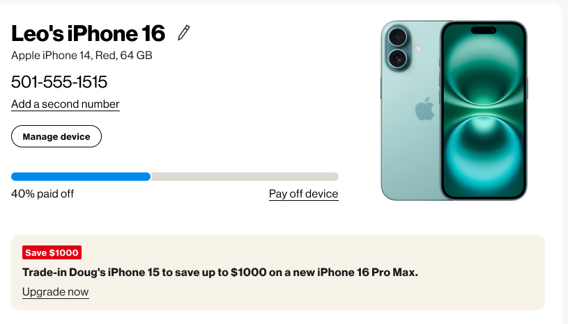
Competing priorities
Bring billing, devices, offers, rewards, and perks together while balancing customer tasks, retention goals, and team constraints.

01 / Verizon · Account experience
Aligning teams to create a cohesive, intuitive account dashboard designed to strengthen customer loyalty and retention.

01 / About the Project
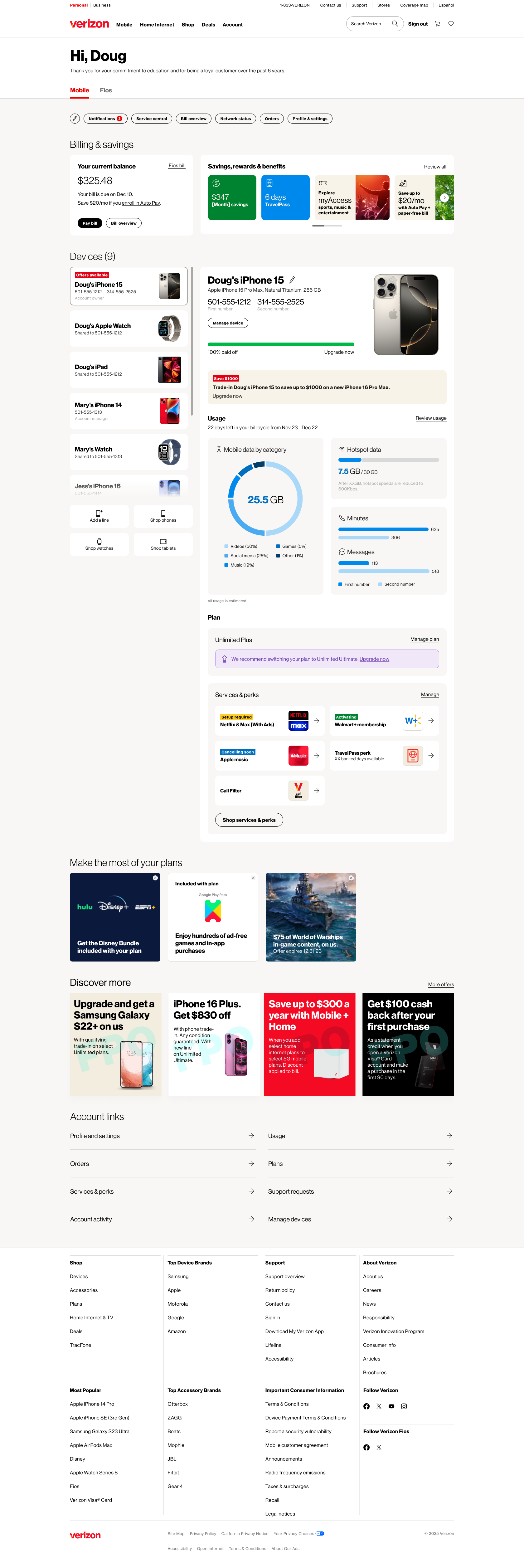
Simplifying account management across billing, devices, usage, and rewards.
Bring billing, devices, offers, rewards, and perks together while balancing customer tasks, retention goals, and team constraints.
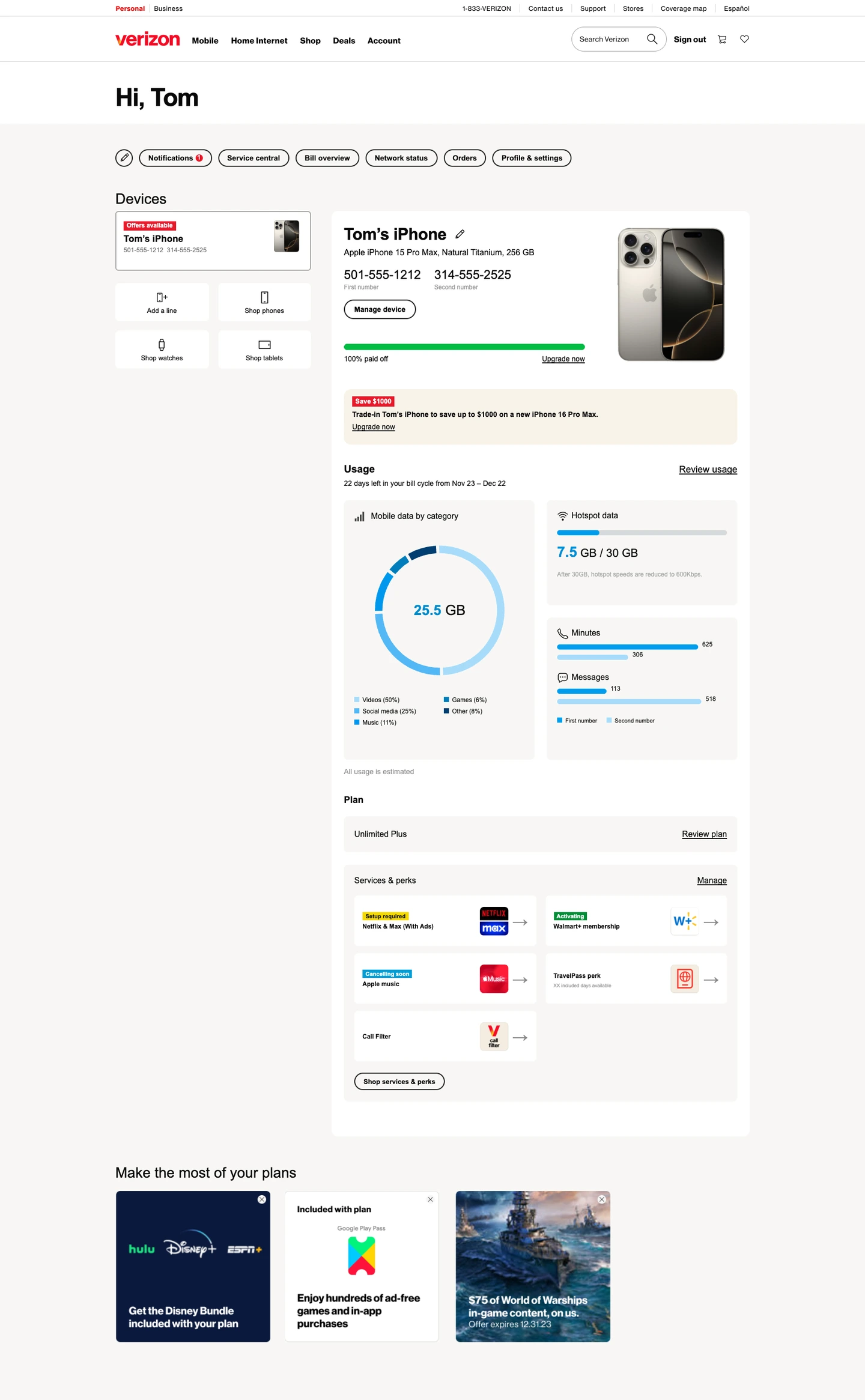
Combine billing, devices, usage, and rewards in one consistent dashboard, making everyday account tasks easier across desktop, mobile, and the My Verizon app.
Customers in the study found the dashboard organized, personalized, and easier to navigate.
“Everything is right there on the page.”
02 / Customer research
Feedback from Verizon wireless customers helped us prioritize account tasks and information.
Make billing, device management, and plan settings easy to find and use.
Lead with account status, alerts, and clear next steps.
Show relevant usage, savings, and benefits.
03 / UX & Visual Design
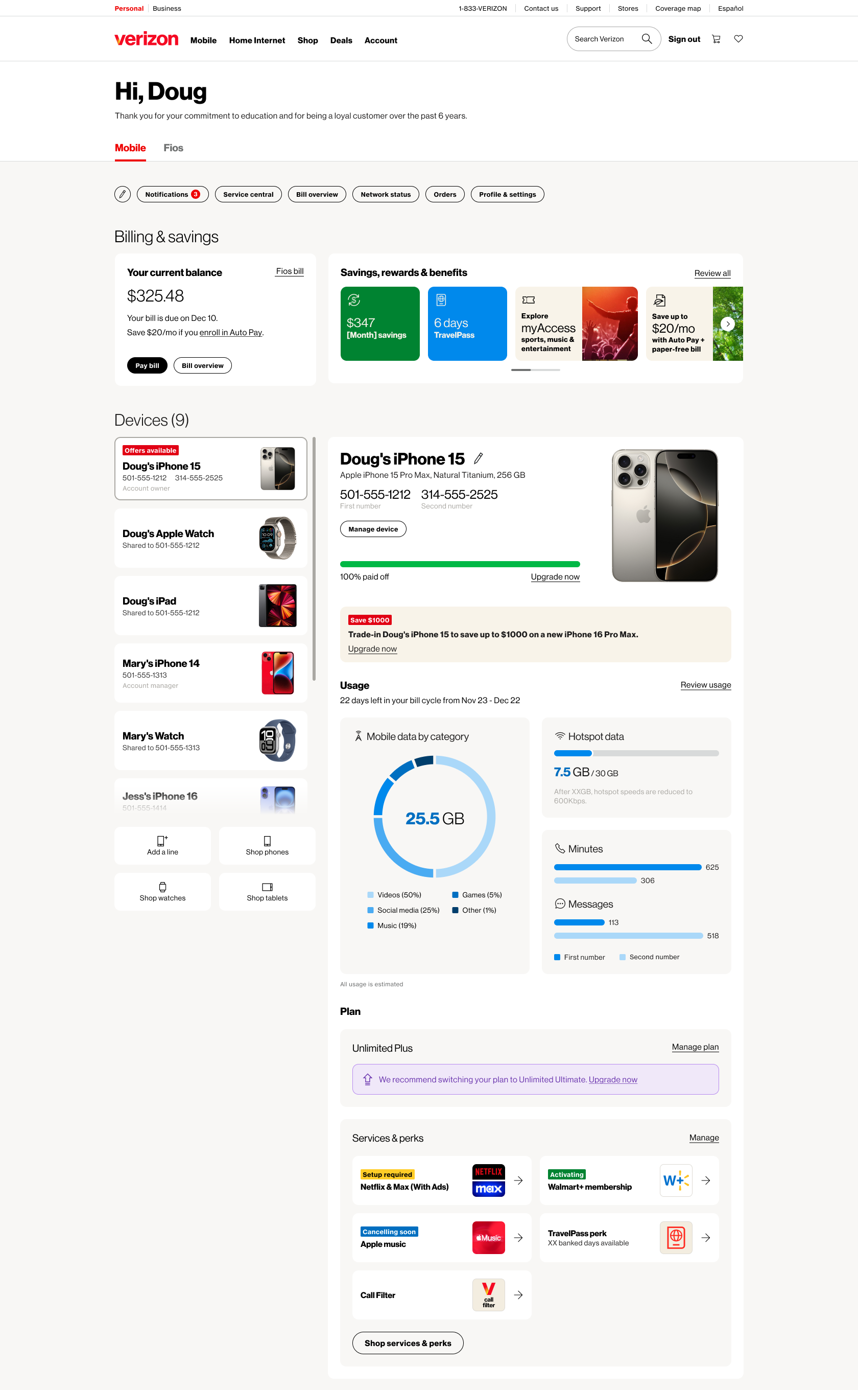
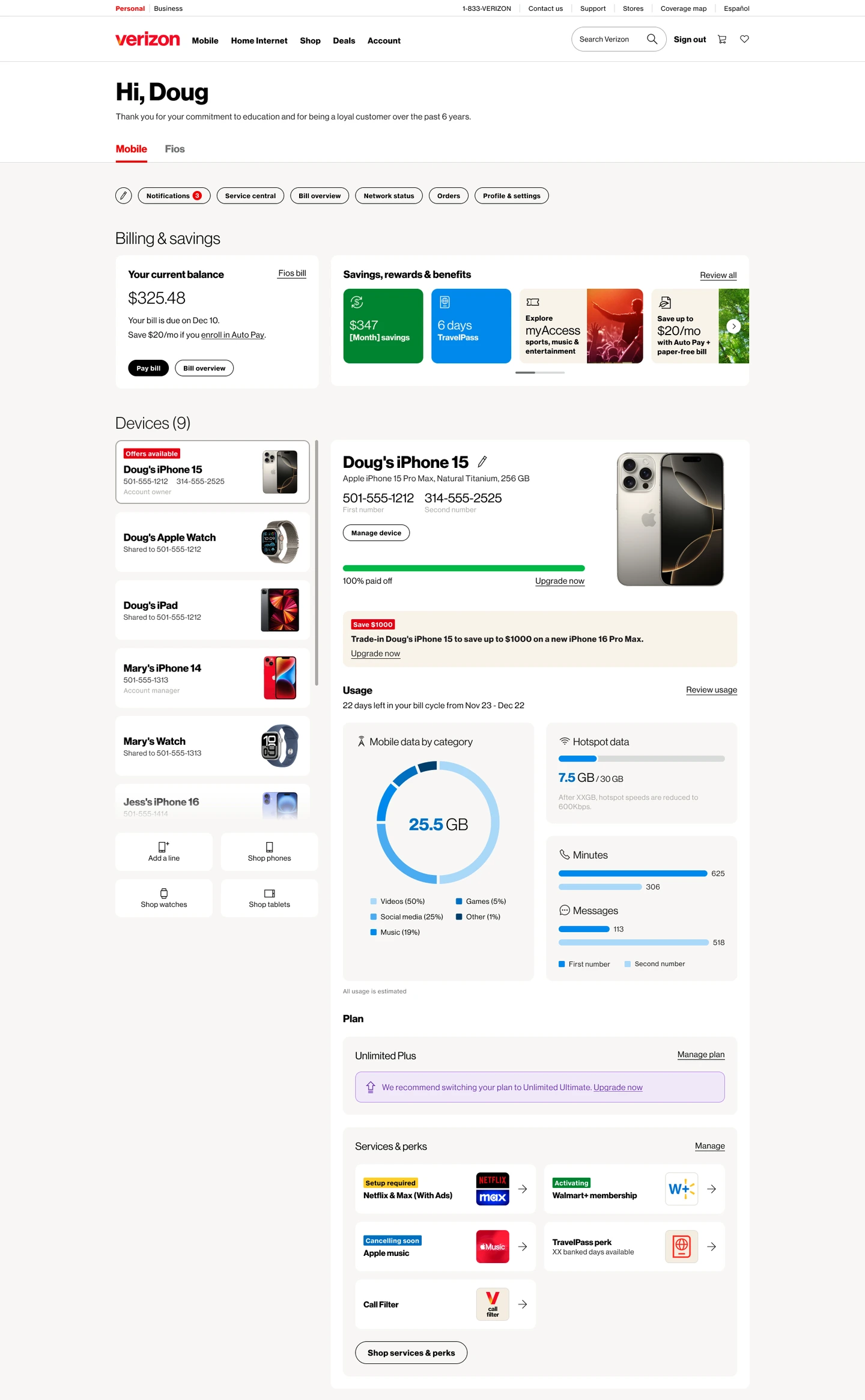
A shared structure connected shortcuts, billing, devices, usage, and account roles.
Customizable shortcuts gave customers one-click access to bills, notifications, and account tasks, with controls to remove or reorder them.
Reported shortcut click-through rates.
Bills, payment actions, savings, and benefits were grouped so customers could review their account in one place.
Benefits customers use most, according to 76 Verizon employees.
We surfaced device details and management controls in one view, with a progress bar showing three payment states: pay off, return and upgrade, or upgrade now. Working with marketing, we developed relevant offers that linked to My Offers.
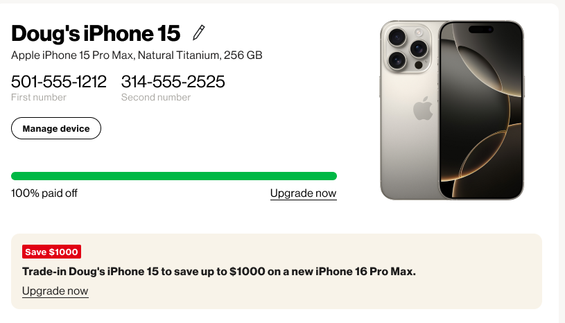
We connected device selection to detailed account pages across desktop, mobile, and the app. Working with engineers, we combined data, hotspot, minutes, and messages within technical limits.


Account owners and members saw role-specific information and actions within the same dashboard structure.
04 / Customer evaluation
Customers found the dashboard organized, personalized, and easier to navigate to essential tasks.
Their feedback guided refinements to usage details, offers and messaging across our team and multiple Verizon teams.
Customer evaluation: Verizon Customer Marketplace Insights. Remote moderated mobile interviews with 12 wireless customers, including owners and managers. Findings describe reactions to the evaluated design.
Benefits discovery: Your Voice Matters. 76 employee respondents across retail, inside sales, customer service, and indirect channels. This is employee feedback about customer needs, separate from the direct customer study.